Hemlock + Co
Freelance. Art direction and brand identity design, working directly with the client.
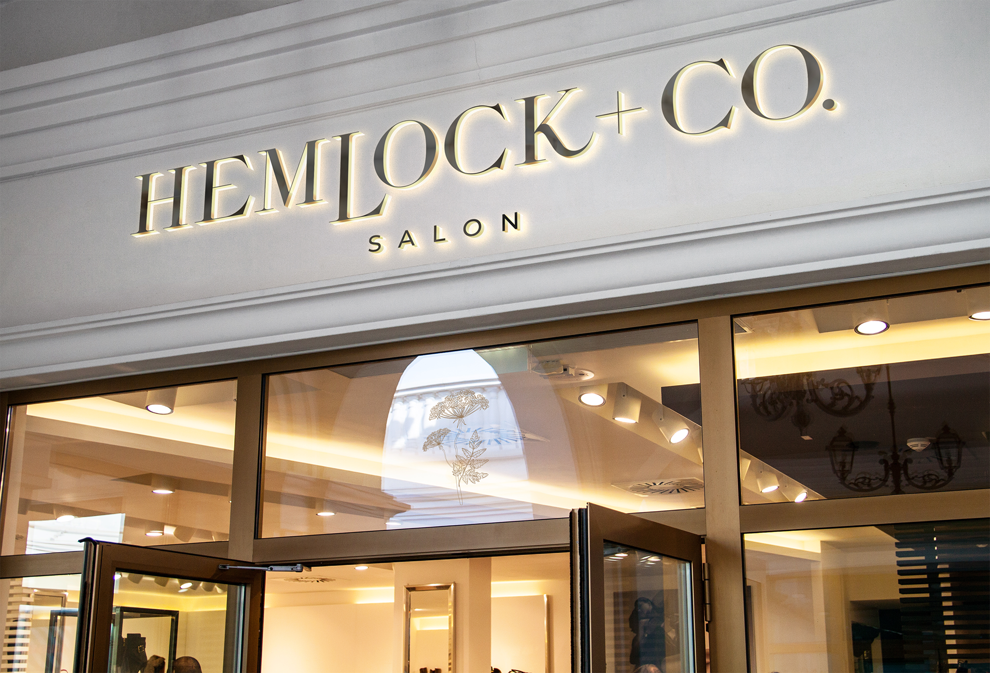
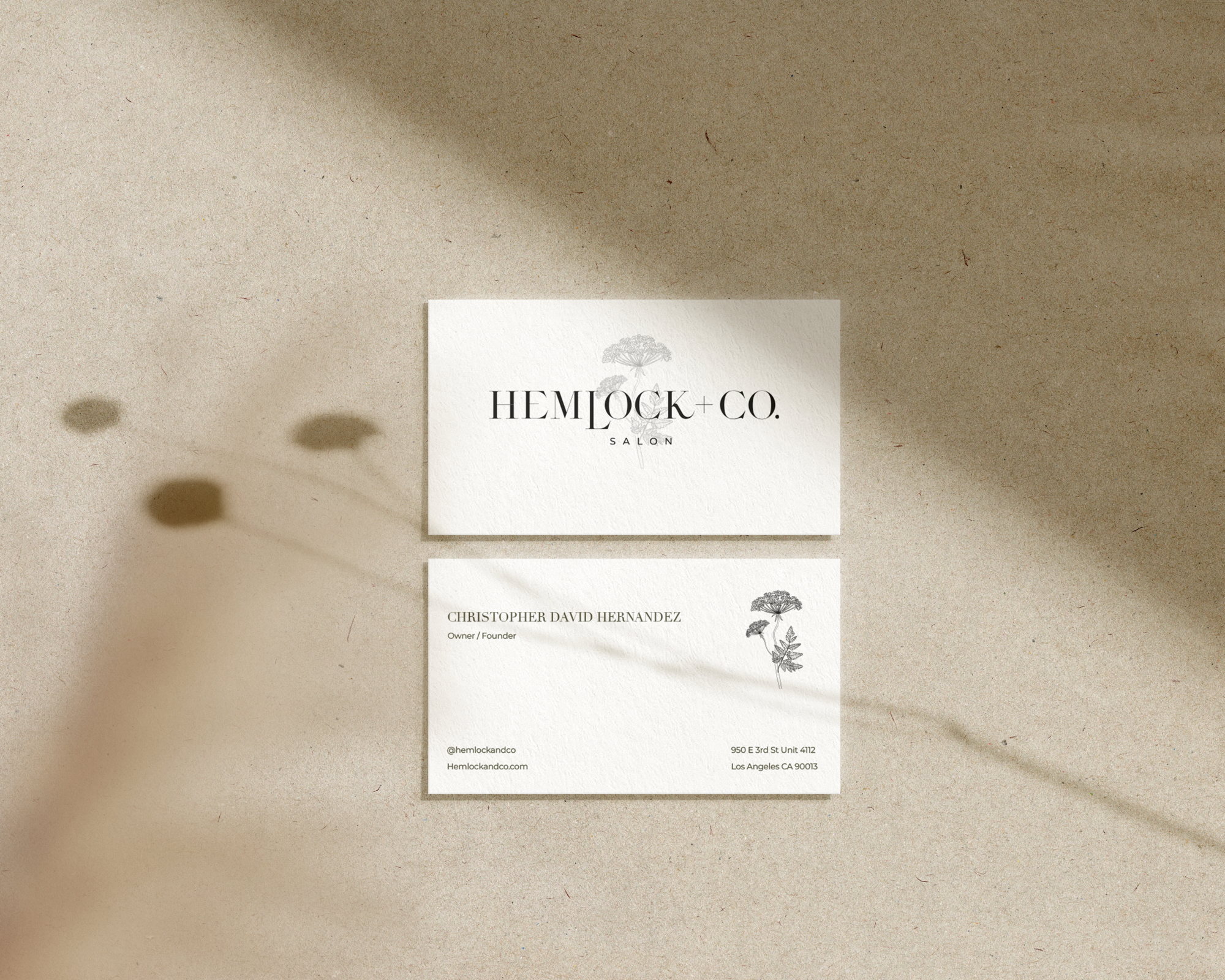
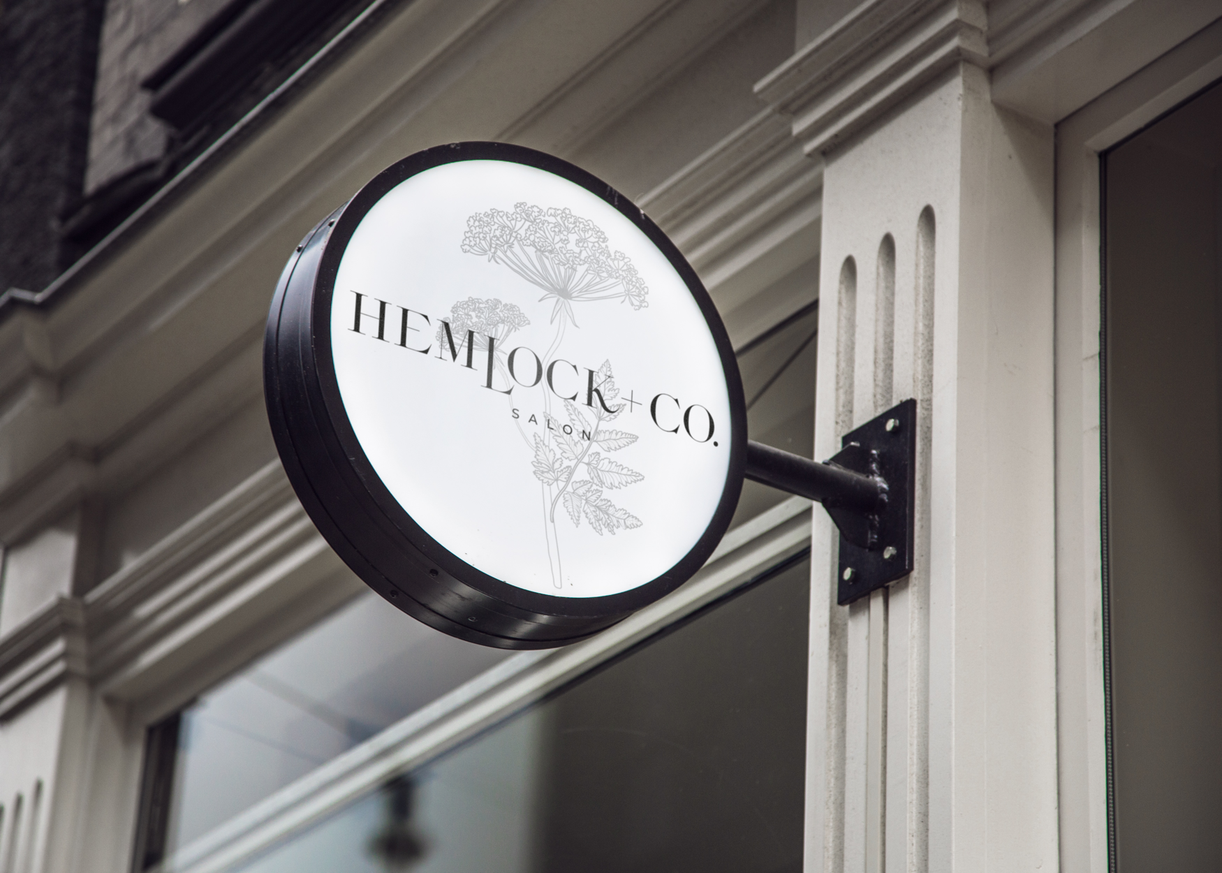
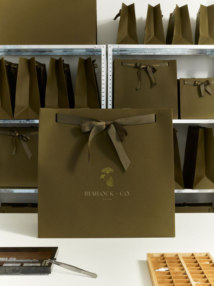
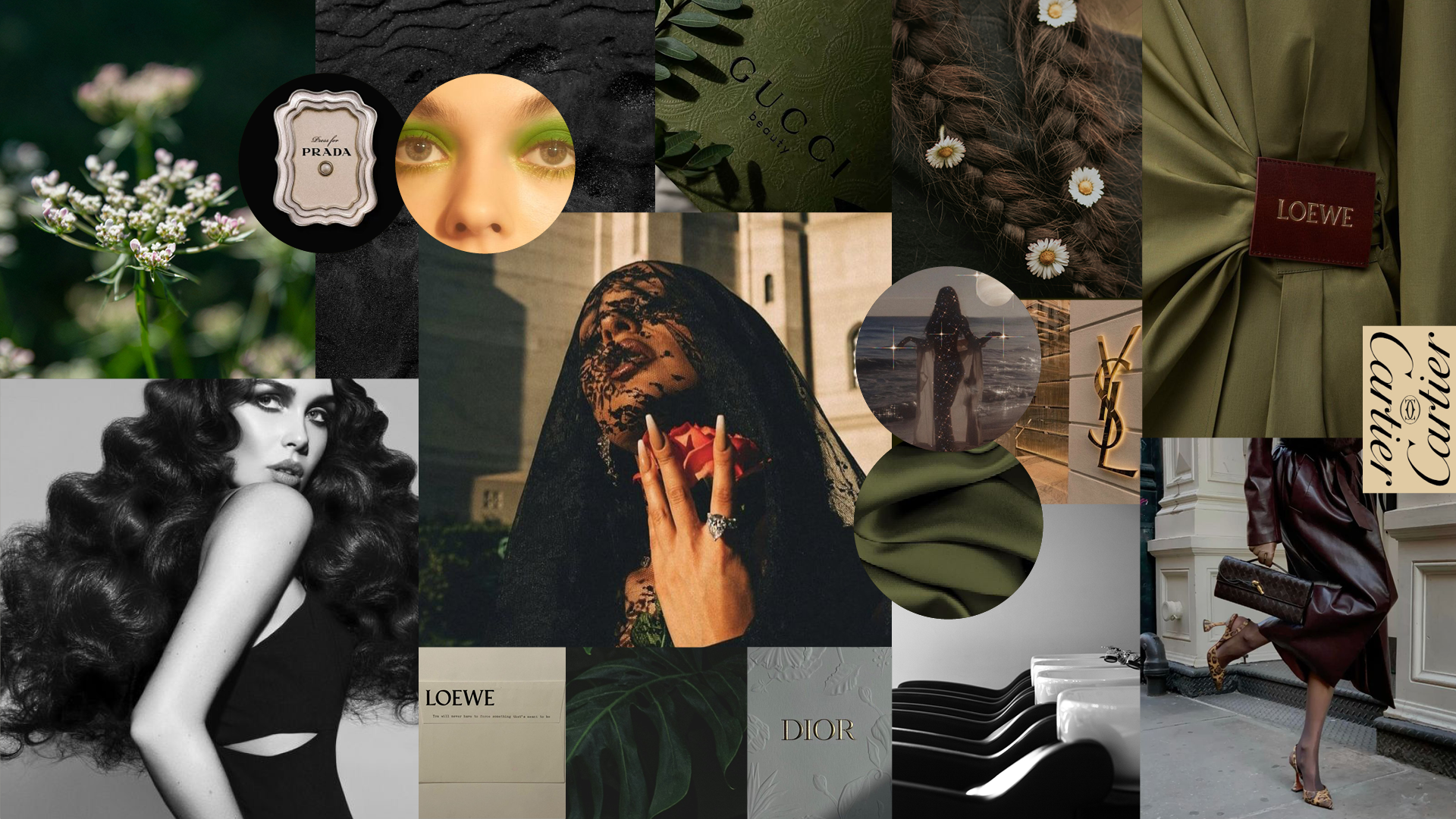
The salon is built on a partnership, and the identity needed to feel like a sanctuary of style: high-end, but also ethereal. The process began with seven logo directions, each with its own iconography, rooted in the Hemlock flower, a symbol of purification and protection. Several marks use two flowers to represent the owners and their shared vision. A timeless serif paired with a clean, modern sans-serif carries the brand from the first round through to the final system, seen here on the storefront, signage and business cards.