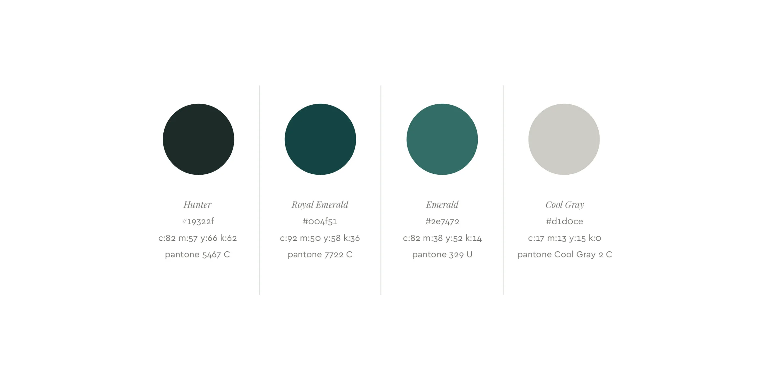
Outro Co.
Freelance. Art direction and brand identity design, working directly with the client.
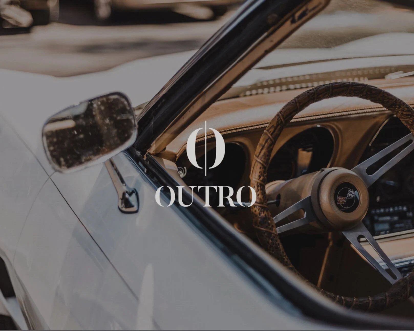
Outro needed an identity that carried the musicality in its name and felt luxurious and refined, for people who are determined, focused and aspirational. The logo pairs a classic serif with a custom treatment inspired by musical notation. A horizontal bar suggests staff lines and rhythm, runs through the icon and repeats in the round forms of the letter O, linking icon and wordmark.
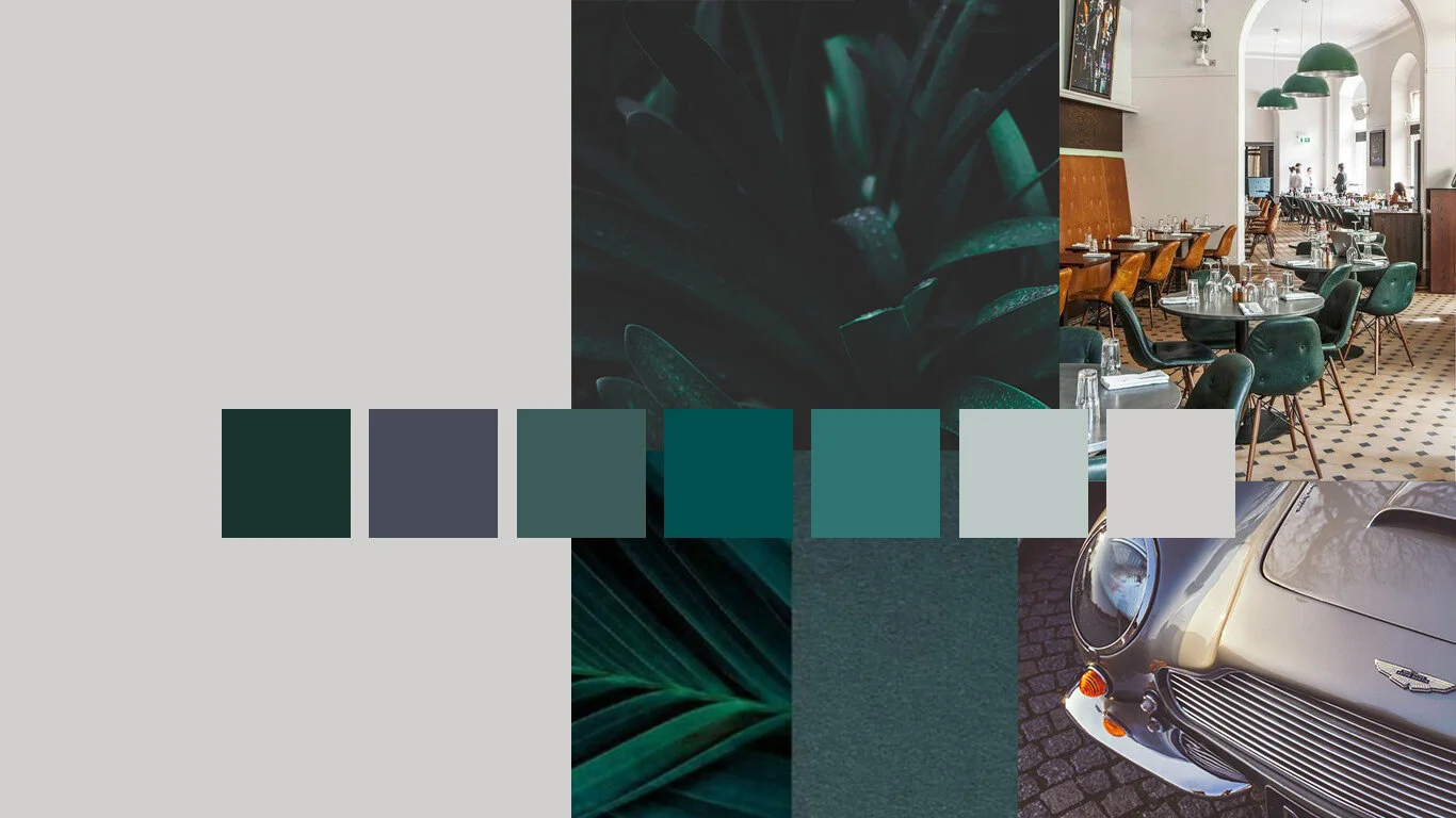
“The colors are rich but muted, the lighting is dramatic, the people are attractive yet unique."